Thinx Website Redesign
Scope
Website redesign | Rebrand | New user acquisition
Opportunity
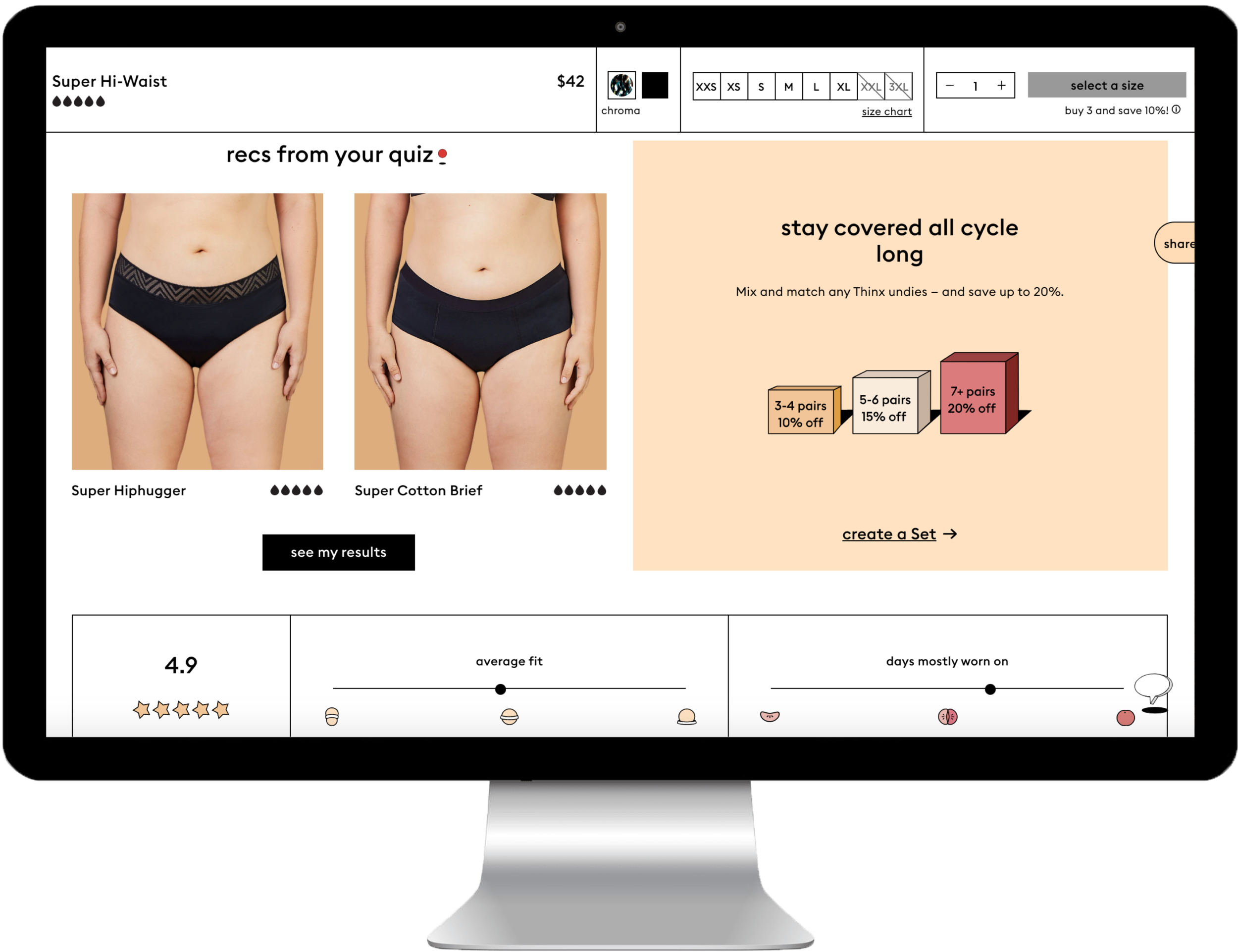
As Thinx’s brand recognition grew, new user acquisition was not growing proportionately. Through user research we knew that there were certain barriers to purchase for new users which could be addressed through product education and a strategic, user-centered re-design. The redesign of the Thinx website aims to incorporate compelling moments of product education along the user journey and to create a design system that is digitally native, accessible, and scalable.
Project Impact
The Thinx redesign began in January 2020 and is scheduled to complete by April 2021. The redesign is happening in four development phases, which are prioritized by impact.
Current Thinx conversion rate: 2.92%
Post-Redesign conversion rate: TBD
The Thinx website is currently being redesigned in four prioritized stages to be completed by April 2021. The current site doesn’t have a web style guide and wasn’t built within a design system with breakpoint and grids. One of the goals of this redesign is to create these systems and to ensure that the design is accessible, user-centered, and scalable. This redesign will create a clear and direct path to purchase, as well as incorporate moments of product education along new user journeys. At the redesign’s completion we hope to see an increase in overall user conversion that’s in parity with the Speax and BTWN websites.
My Role: UX Research and Design Lead, Digital Strategy, Product Manager
Team: Brendan Hastings (VP Digital Product), Meng Shui (Creative Director), Jenny Liu (UX Designer), Kim Suchi (Visual Designer), Joycelyn Cheng (UX Researcher), Chris McKenzie (Lead Developer), Andrew Puig (Developer), Morgan Kestner (Developer), Dan Hemerlein (Developer), Sonia Putzel (Developer)
project highlights
User Research and Analysis
Thinx website’s tone and imagery were outdated and aged. Through significant user research we found that models who appeared angry or unhappy, and copy that read as “Millennial” slang were no longer resonating with our initial consumer base or the older consumer demographic we were attempting to reach. In focus groups conducted in Dallas, Kansas City, New York City, and Los Angeles, we further evaluated the website designs, as well as a new creative direction to understand what would resonate. Finally, before kicking off the Thinx redesign, we hosted collaborative persona and user journey workshops to organize our findings and create the site structure and idealized user flows.
Product Education
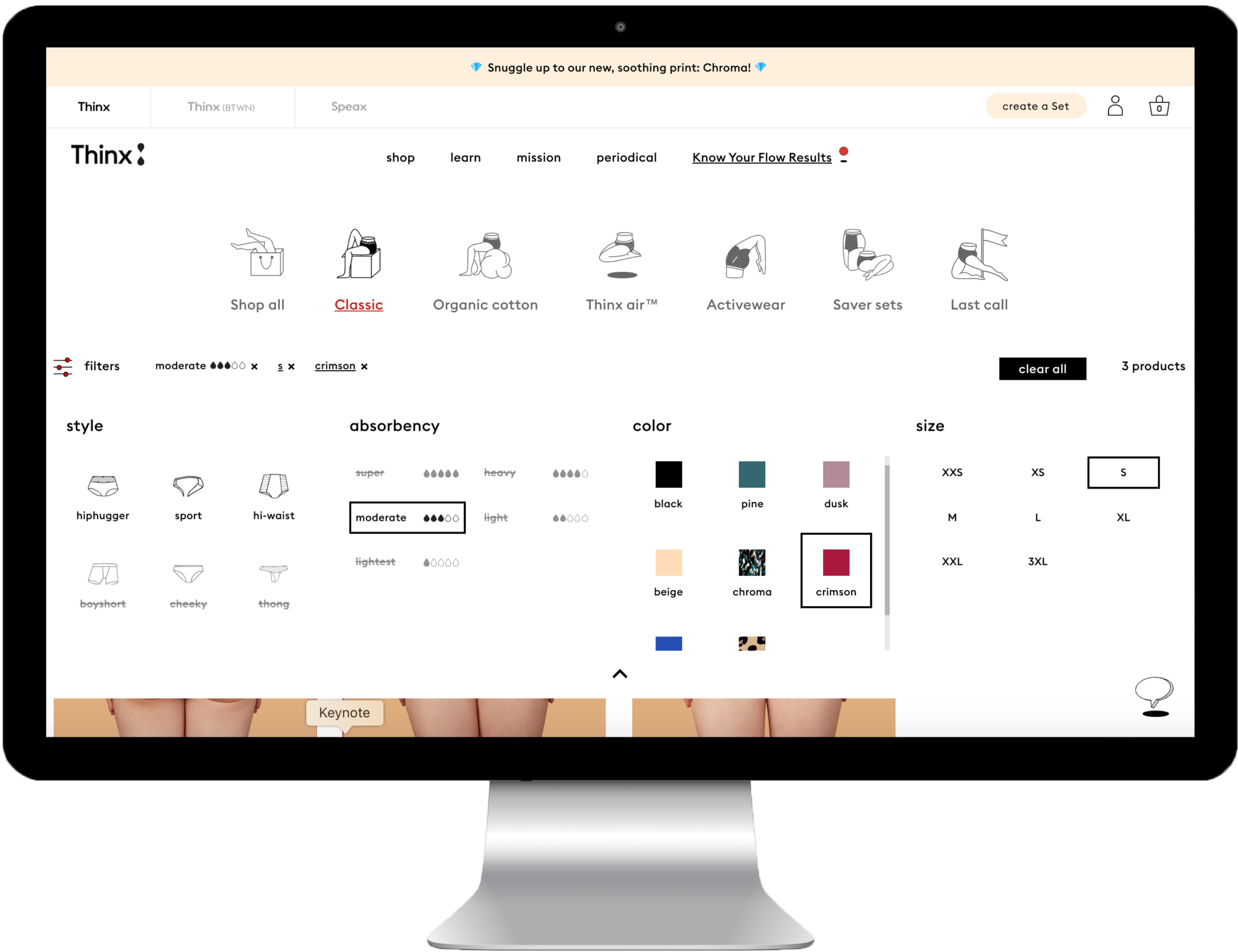
Thinx underwear is an entirely new category of menstrual product, meaning consumers need to understand how the underwear works and learn a new set of behaviors. Additionally, being an e-commerce brand with 98% of sales online, there are more obstacles such as sizing, returns, and the fact that users can’t see or touch the product. To convert users the website must provide all this information, as well as educate users on how the different styles and absorbencies of Thinx will best fit their menstrual flow and period routine. One way we provided this was by creating a droplet system to convey absorbency; we use the same calculations from the ‘Know Your Flow’ tool to expose how each droplet rating compares to the absorbency of more traditional period products.
Design and Brand Leaders
Thinx is known for its strong brand identity and bold taboo-breaking campaigns and imagery. Thinx strives to be intentional, fresh, and surreal - mixing humor with seriousness. We reject flowers, blue liquid, pink, women skipping through fields, and embrace the reality of periods. This design style and Thinx's photography style, in which models exude strength and control on flat color backgrounds, became immediately popular and mimicked by other e-commerce brands. Thinx is not only an innovative company, we are innovative design leaders and it’s important we continue to build on this reputation and allow it to shine through in our redesign.
Digital Strategy
Thinx is the final of the Thinx Inc brands to be redesigned into a user-centered, scalable, digital system. Over the past year, the brand has been expanding its product line and will continue to expand. Therefore, a very important aspect of the redesign is future-proofing the information architecture and collections pages to support this growth. Additionally, the digital strategy focuses on prioritizing educational user flows so the site equally supports new and returning user goals. We've also had an intense focus on optimizing the user journey from first touch in marketing, to the most common landing pages, to check out and post purchase, connecting every touchpoint to an organized user journey experience.


