Speax website
Scope
Rebrand | Website redesign | Creation of Thinx Inc
Opportunity
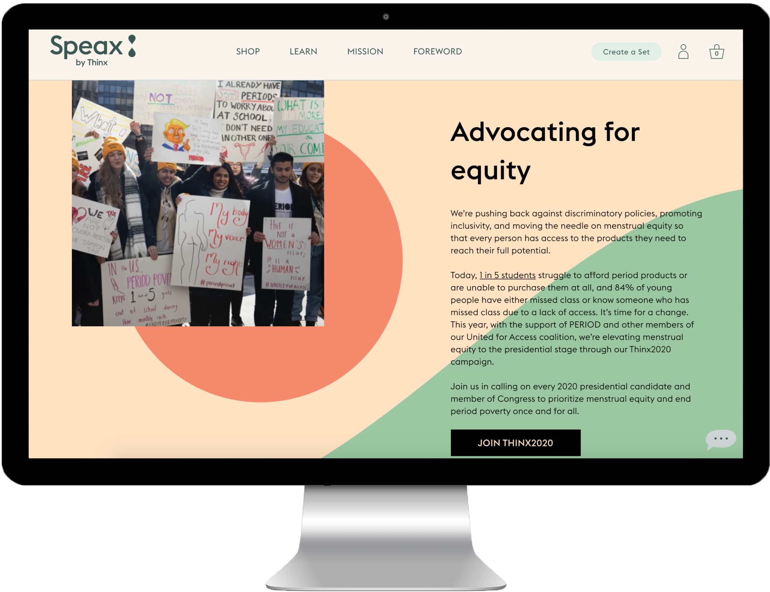
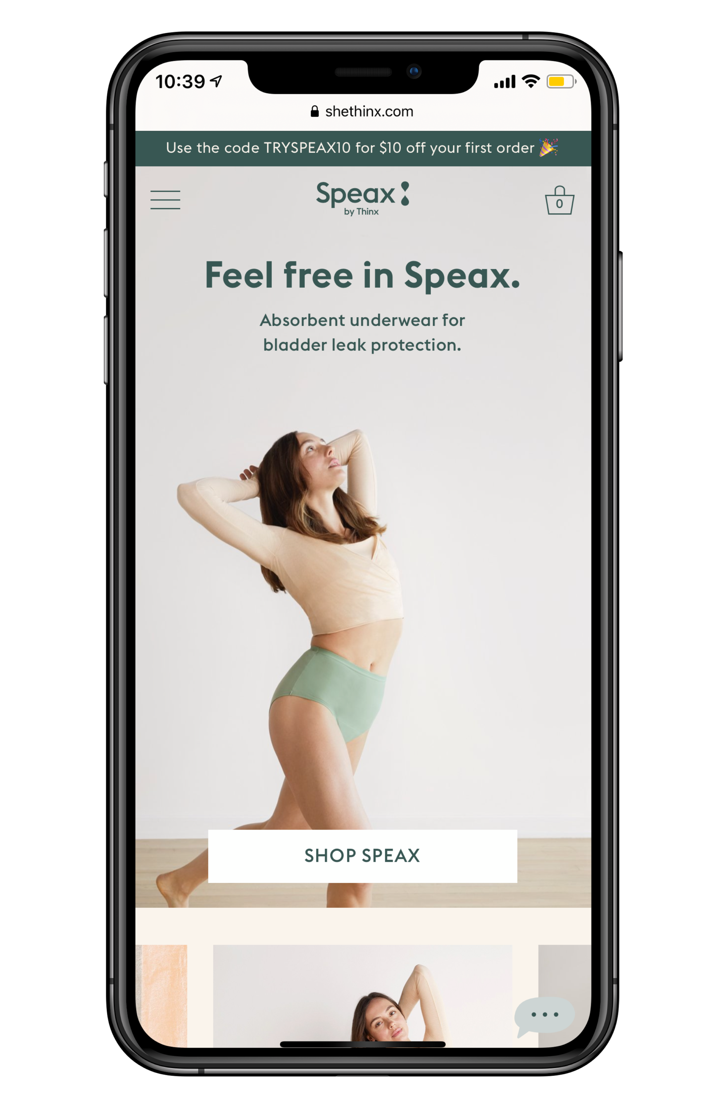
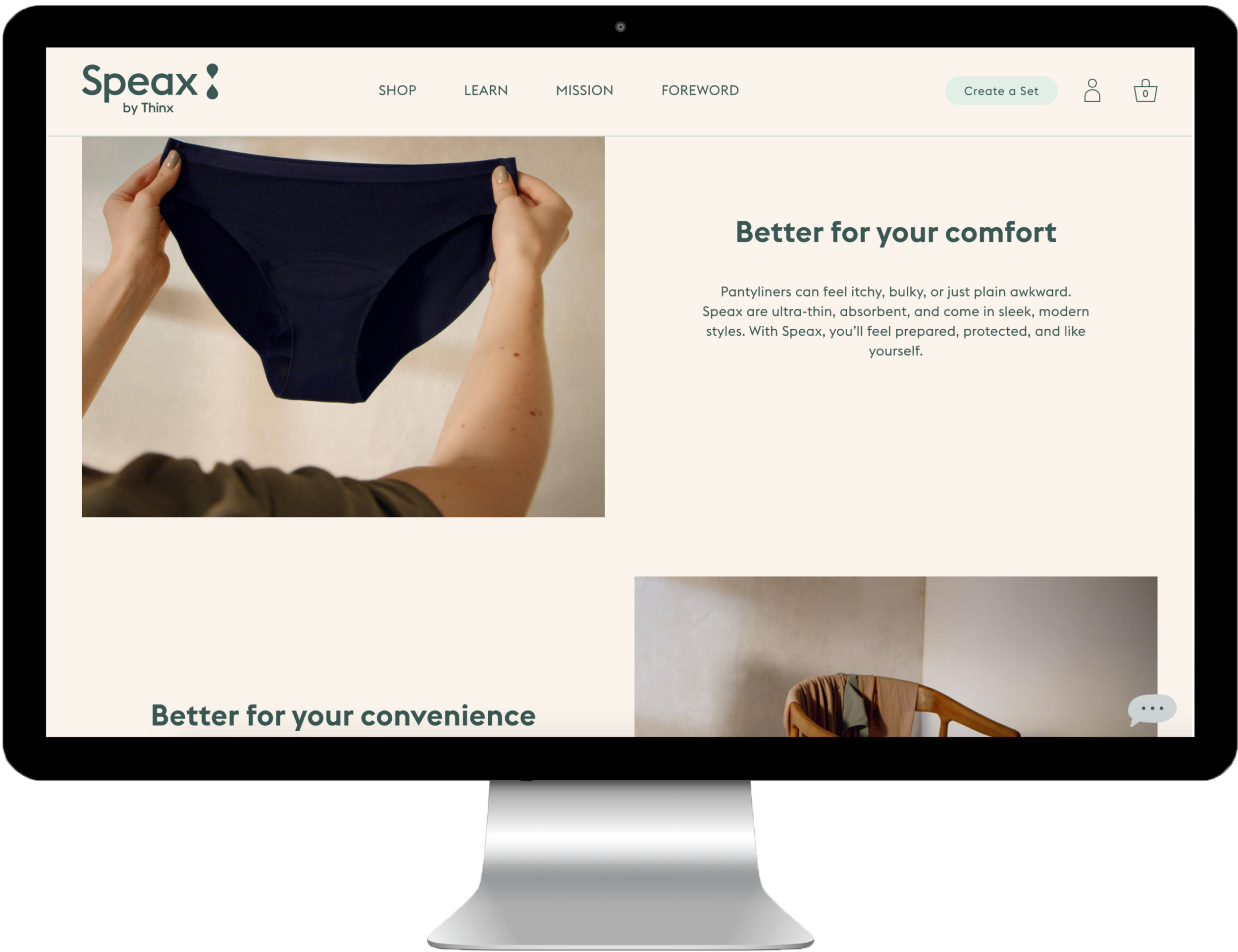
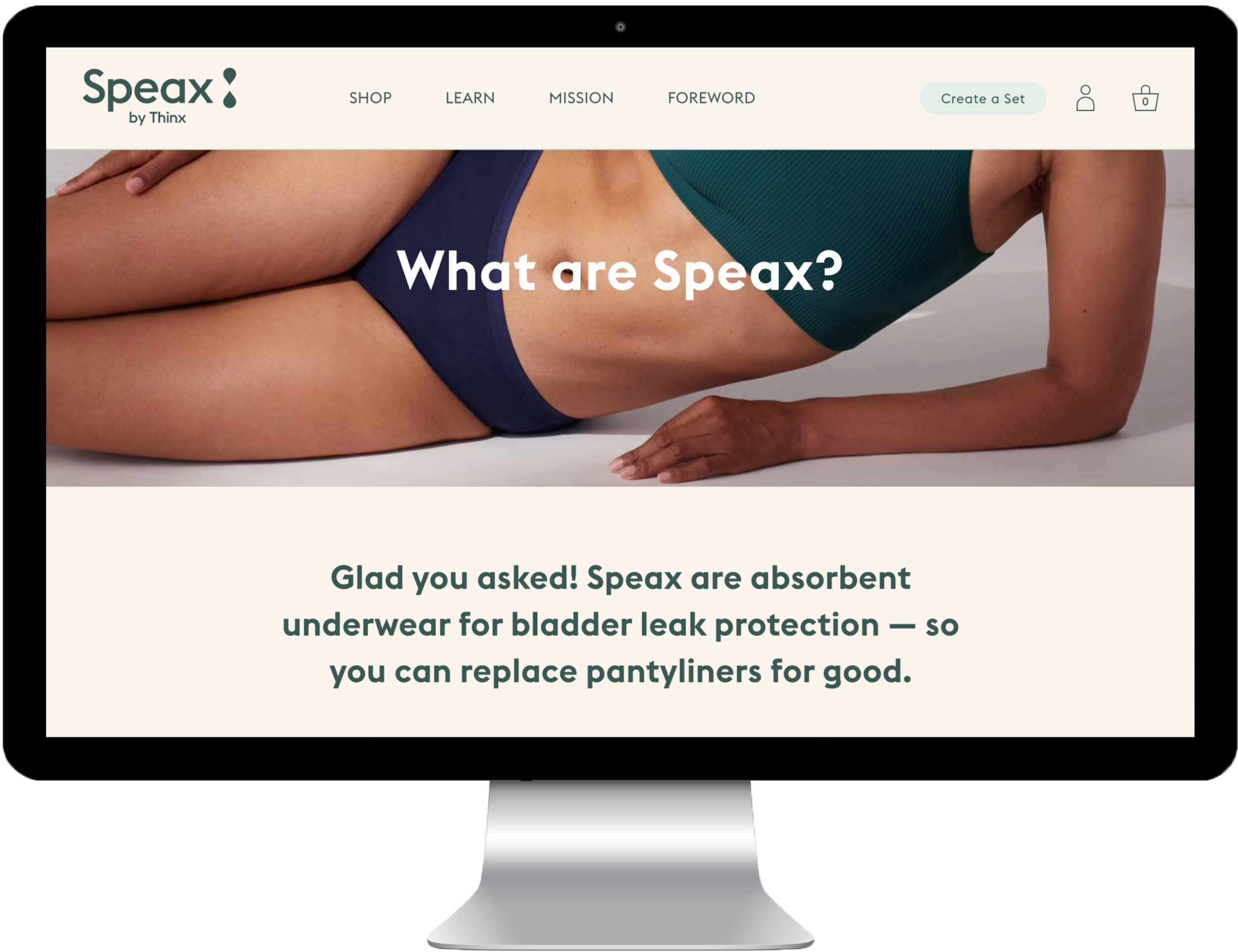
The brand recognition and growth of the Icon Undies business was not as strong as its sister brand Thinx. Icon was rebranded as Speax and the site was completely redesigned with a user-centered approach and the creation of a digital design system. As part of this redesign, Thinx Inc was created and all three brands (Thinx, Speax, BTWN) were unified. By unifying Speax and BTWN with the stronger brand recognition of Thinx, the goal was to see a positive brand halo effect, as well as create a platform of commerce, content, and community for women aged 8 until the end of life.
Project Impact
Speax conversion rate: 4.32% (+105.7% uplift)
Tri-Brand Navigation encouraged traffic between brands and cross-brand shopping:
Speax site drives 11.99% traffic to Thinx, 3.47% to BTWN
BTWN site drives 25.37% traffic to Thinx, 7.94% to Speax
Thinx site drives 3.45% traffic to Speax, 3.80% to BTWN
2 months post-launch: Revenue increased across all 3 brands:
Speax: +15.9%
Thinx: +14.7%
Thinx (BTWN): +27.1%
2 months post-launch: Total revenue increase: +$1,024,950.00
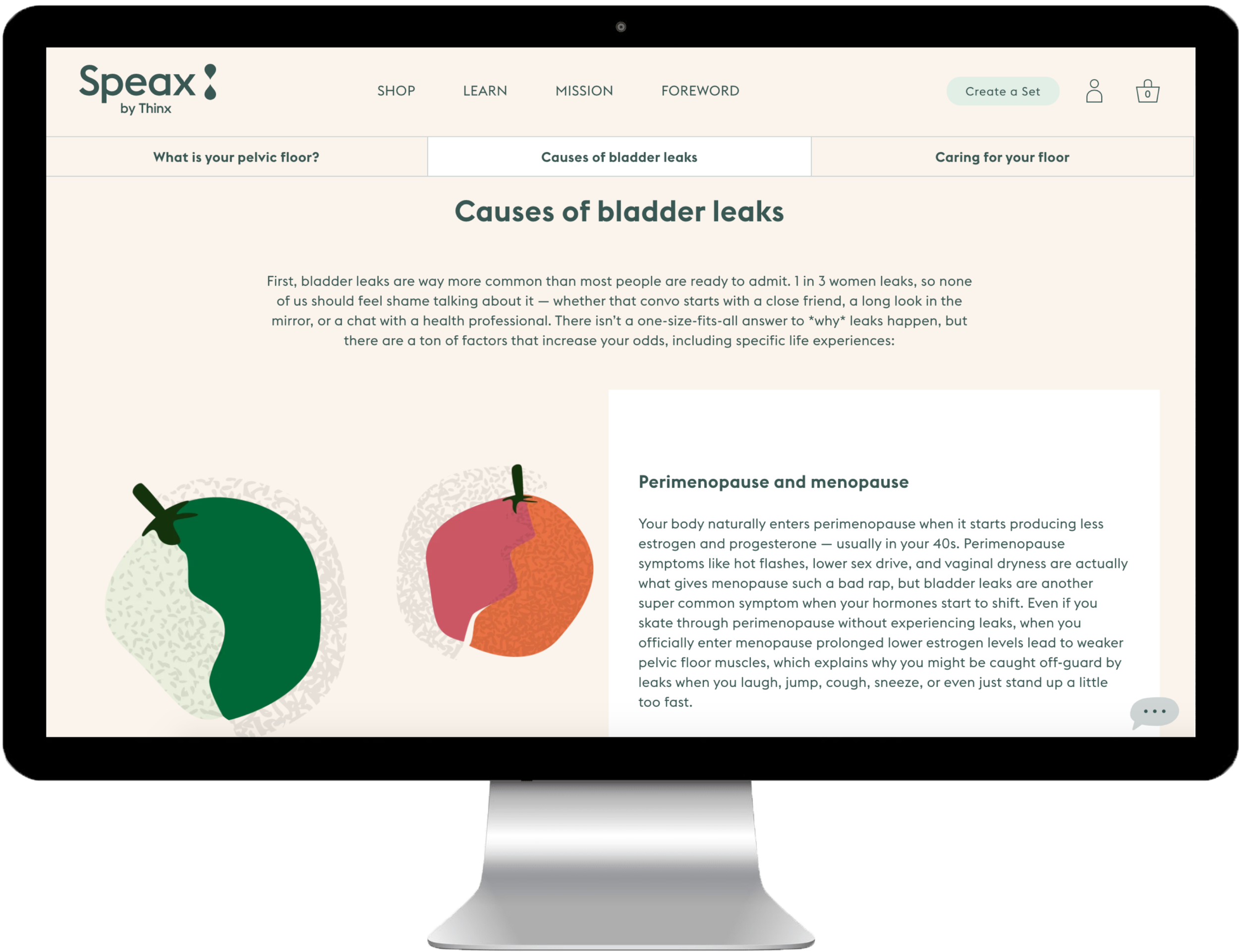
The Speax redesign involved a complete rebrand of Icon, as well as the creation of Thinx Inc, GiveRise, and a tri-brand navigation to unify the three Thinx Inc brands. The site architecture was thoroughly user tested and data-driven resulting in a digital strategy that prioritized a clear and direct path to purchase for returning users and multiple product education paths for new users. The UX team collaborated closely with Development, Creative, Marketing, and CX in order to deliver a user-centered, high-performing (site conversion more than doubled), and on-time MVP in only 6 months.
My Role: UX Research and Design Lead, Digital Strategy, Product Manager
Team: Brendan Hastings (VP Digital Product), Meng Shui (Creative Director), Michelle Flacks (UX Designer), Genna Schwartz (Visual Designer), Elise Mortensen (UX Researcher), Andrew Puig (Developer), Lawrence Stiers (Developer)
project highlights
User Research and Analysis
Prior to the Speax redesign, we conducted significant user testing on the former Icon website in terms of IA testing (tree tests and card sorts), usability tests, and analytics. Through collaborative persona and user journey workshops we compiled these findings to organize the site structure and create idealized user flows. We were also able to evaluate the initial website designs and Speax MVP in Focus Groups conducted in Dallas, Kansas City, New York City, and Los Angeles.
Thinx Inc Strategy: Brand Unification
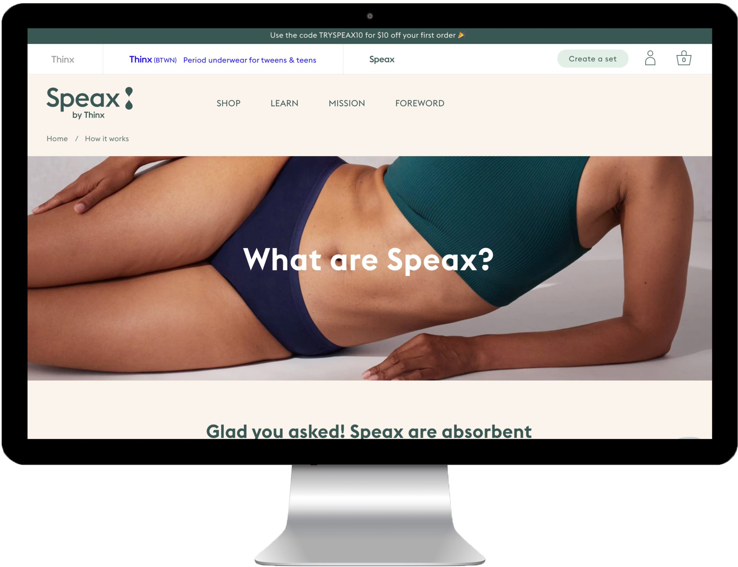
An important part of brand unification was brand education. We accomplished this education through our interactive tri-brand navigation which sits above each brand’s individual navigation. This feature allows users to navigate easily between the three brands and also provides brand education by exposing the brand’s value proposition on hover. In testing it has been successful. In reference to the tri-brand navigation, one focus group participant stated, “They’re trying to reach different generations of women. They’re about taking care of women.”
Thinx Inc Strategy: Account and Cart
Another important feature of brand unification was that the three brands would all share one cart and one account for the first time. To communicate this to users we again utilized interaction in the tri-brand navigation. When a page loads, the tri-brand navigation, containing the ‘account’ and 'cart' icons, loads above the brand-specific navigation. As the user scrolls down on the page, the ‘account’ and ‘cart’ icons slide down to fit into the brand-specific navigation and remains sticky until the user navigates to another page or scrolls back to the top of the page. At that point the tri-brand navigation returns and the 'account' and 'cart' icons slide up into it.
Speax Rebrand (formerly Icon)
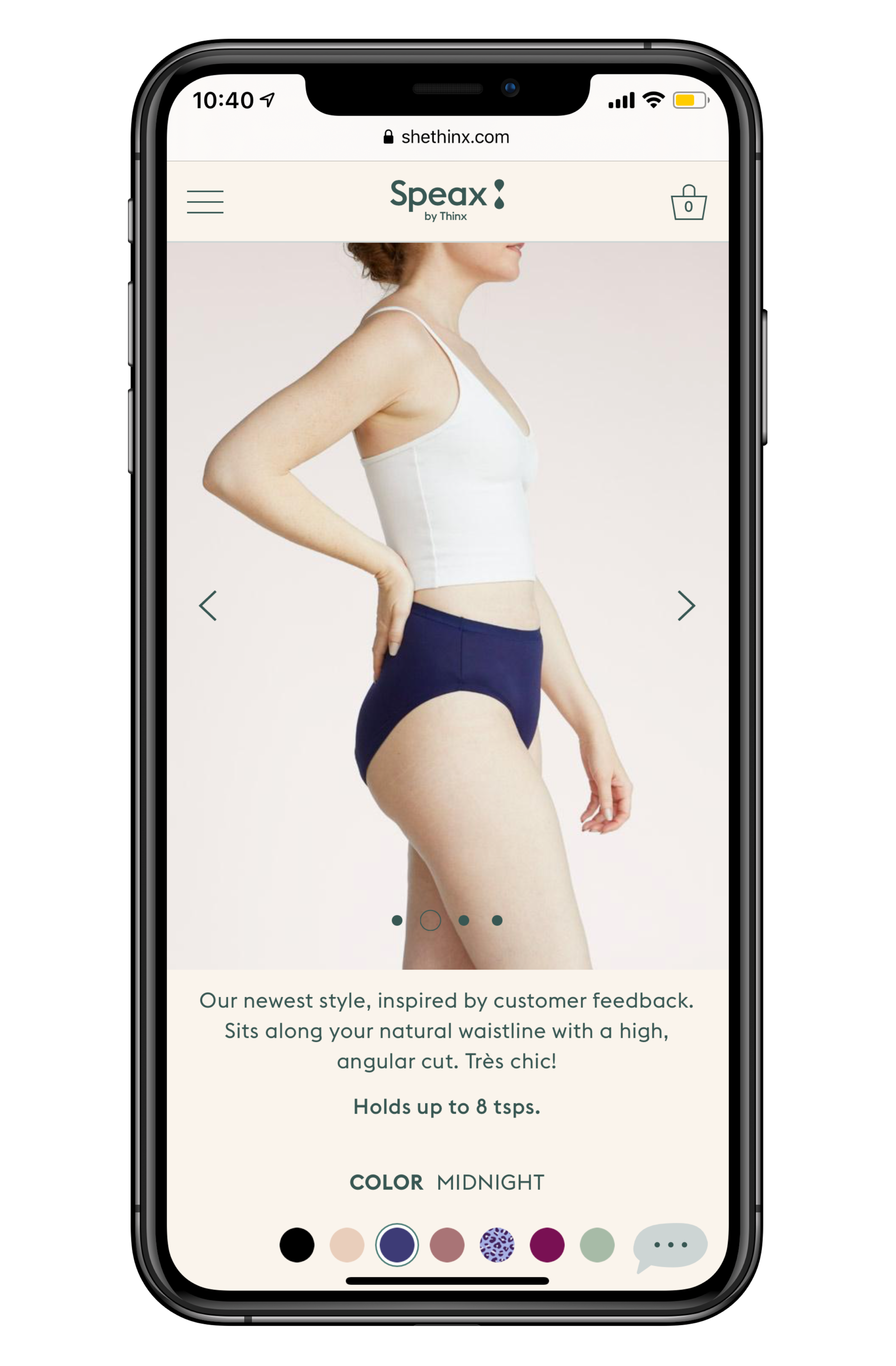
The Speax rebrand was an opportunity to move from a systemless website to a user-centered design system that would deliver on the specific needs of an older audience. For example, prior to this redesign, our Icon audience faced many tech-specific issues such as understanding “where” to buy the underwear. Users would often resort to calling our CX team to place their order. Post the launch of Speax, this issue has been greatly reduced due to our simplified user paths and product pages.
