Thinx (BTWN) Website
Scope
New Product | New User Acquisition | Content and Design Strategy
Opportunity
Thinx (BTWN) is the newest Thinx Inc brand. It was launched in August 2018 after receiving feedback and requests for a teen/pre-teen line of the Thinx product. The business objective was two-fold: to build brand affinity for Thinx by using Thinx (BTWN) as an introductory product and to increase brand awareness for Thinx by marketing the teen line to mothers and caregivers.
Project Impact
Overall user conversion rate: 5.52%
Average month-over-month growth: +53.57%
4.9% of Thinx customers discovered the Thinx brand through their engagement with BTWN
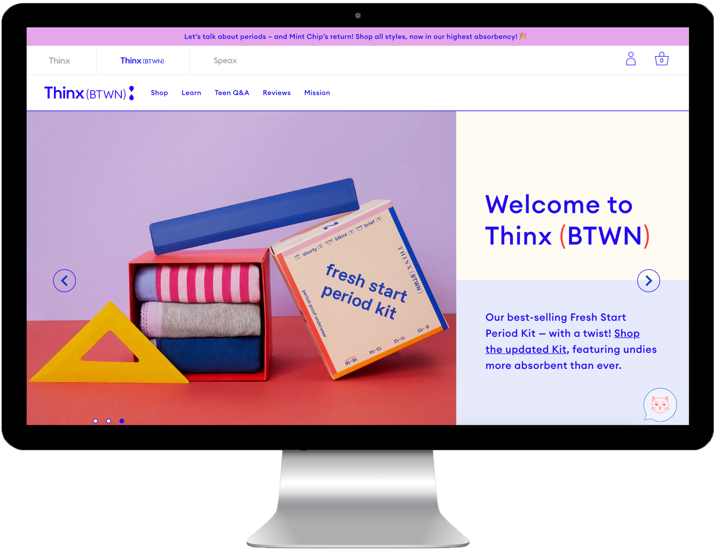
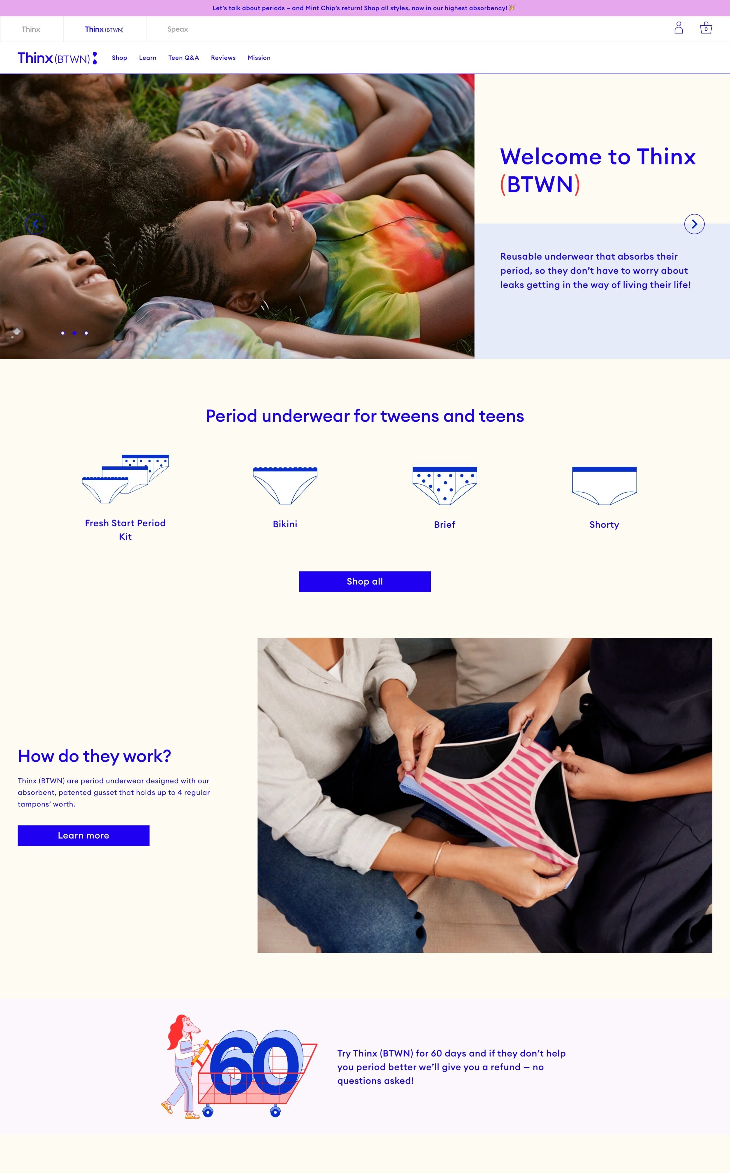
Thinx (BTWN) website was launched to support first and early periods by selling period underwear in teens and pre-teen sizes. Thinx (BTWN) was designed with two major users groups in consideration, teens and parents. Through research we found that the majority of shopping and purchases were driven by the parent or caretaker, but that teens held a minority voice in which brands or products they most wanted. Therefore, our design direction was to create an informative, yet youthful and playful site that would appeal to both user groups. We designed and developed the MVP in a tight three month timeline.
My Role: UX Research and Design Lead, Digital and Content Strategy, Product Manager, QA
Team: Brendan Hastings (VP Digital Product), Meng Shui (Creative Director), Michelle Flacks (UX Designer), Kim Suchi (Visual Designer), Elise Mortensen (UX Researcher), Andrew Puig (Developer)
project highlights

User Research and Analysis
There was relatively little research done prior to deciding to launch the Thinx (BTWN) product line, so the UX Team became integral in leading the exploratory user research that would define the digital strategy. We ran 8 focus groups in Houston and New York City with young girls (ages 10-12, 13-4, 15-16) and parents of pre-teens in order to understand how teens and parents navigate personal purchasing decisions and also to learn what content, education, visual-approach, and audience to prioritize in design.

Creative and Content Strategy
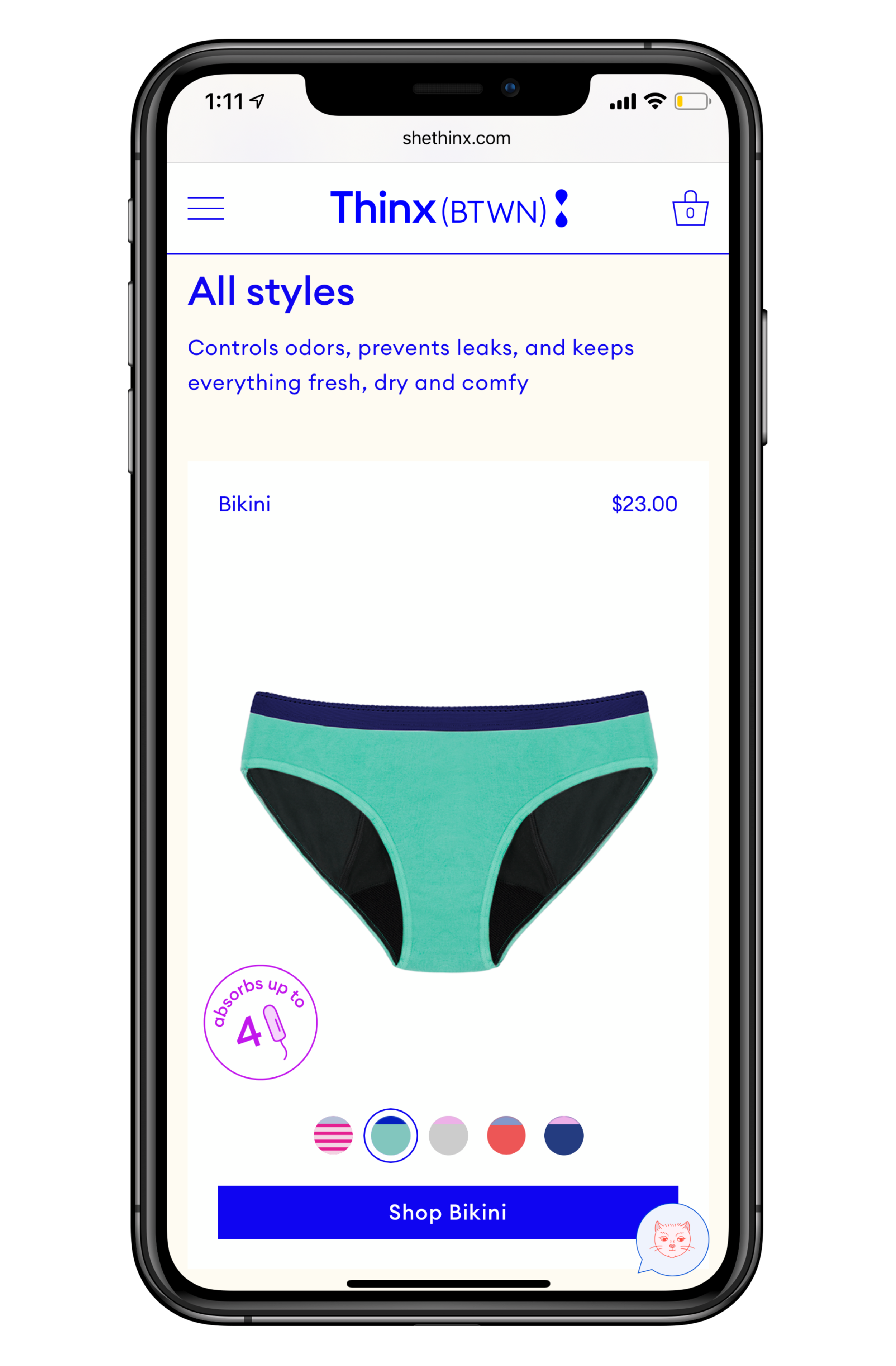
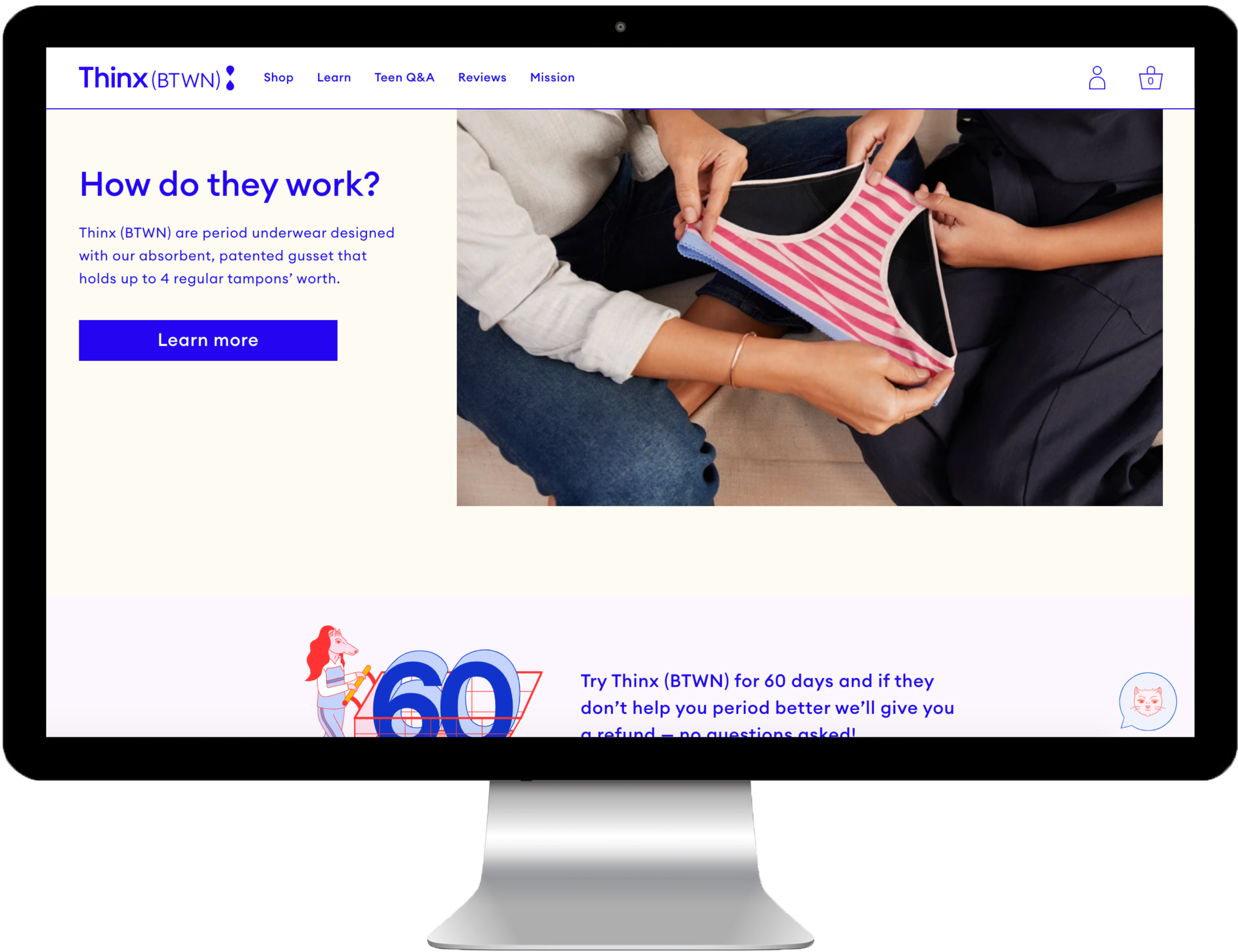
The brand team decided early on that we would never show pre-teens and teens in the underwear on the website to avoid any type of sexualization. Therefore it was very important to communicate who the underwear was meant for using other visual cues . Through user testing we found that parents were very sensitive to images where the teens looked “too mature” with poses or “high fashion” attitudes. Both parents and teens wanted to see images of teens being active as if putting the underwear to the test.

Introduction of Design and Development Sprints
I led and managed the first ever design and development sprints at Thinx in order to deliver a user-centered, high-performing, and on-time MVP in a tight three month timeline. This was also the first digital product at Thinx to have a web style guide and digital design system, which allows for quick and cost-efficient iteration.
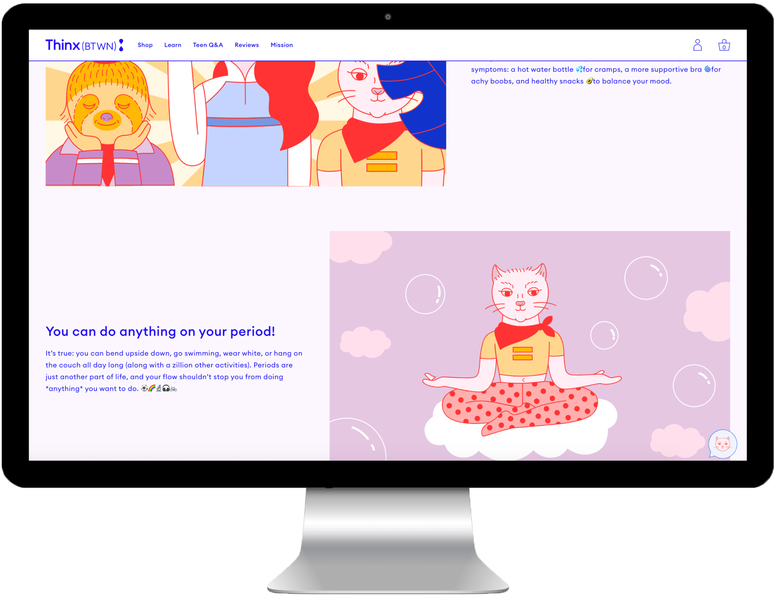
Playful and Fun
Through user research we found that both parents and teens were drawn to the playful design of Thinx (BTWN). However, we also found that our three BTWN characters were polarizing; the teens found them quirky and fun, whereas the parents thought they were weird and would be disliked by their teens. We addressed this by limiting the use of the characters on the core journey pages that parents were most likely to visit, while highlighting them on pages that had a teen-focus.